

The Problem
For adults aged 20 and older, more than two-thirds (68.8 percent) are considered to be overweight or obese while more than 1 in 20 (6.3 percent) are considered to have extreme obesity. The medical care costs of obesity in the United States are high. In 2008 dollars, these costs were estimated to be $147 billion. The annual nationwide productive costs of obesity obesity-related absenteeism range between $3.38 billion ($79 per obese individual) and $6.38 billion ($132 per obese individual) Obesity is a serious concern because it is associated with poorer mental health outcomes, reduced quality of life, and the leading causes of death in the U.S.
Working with 2 other UXers we decided that the goal was to create a mobile first website that would increase awareness of the benefits of eating healthy and help people find and cook meals with minimal effort.
Research and Interviews
As a group, we made a list of assumptions:
- Hard to find healthy food choices
- Fast food is easy and cheap
- Eating healthy food is expensive
- People are generally uneducated about what is in their food
- It’s difficult to change eating habits
- People don’t want to cook
- People don't have time to cook
- Hard to find healthy food choices
- Fast food is easy and cheap
- Eating healthy food is expensive
- People are generally uneducated about what is in their food
- It’s difficult to change eating habits
- People don’t want to cook
- People don't have time to cook
Next it was on to the interviews to test our assumptions. I interviewed 7 individuals in the 22–26 age range. I conducted the interviews in-person and recorded the answers.

Persona
Once the team completed the interviews we were able to look at all of the data and found similarities between them. With this information, we created a persona with goals, frustration, and motivations. (I created the persona page)

Persona
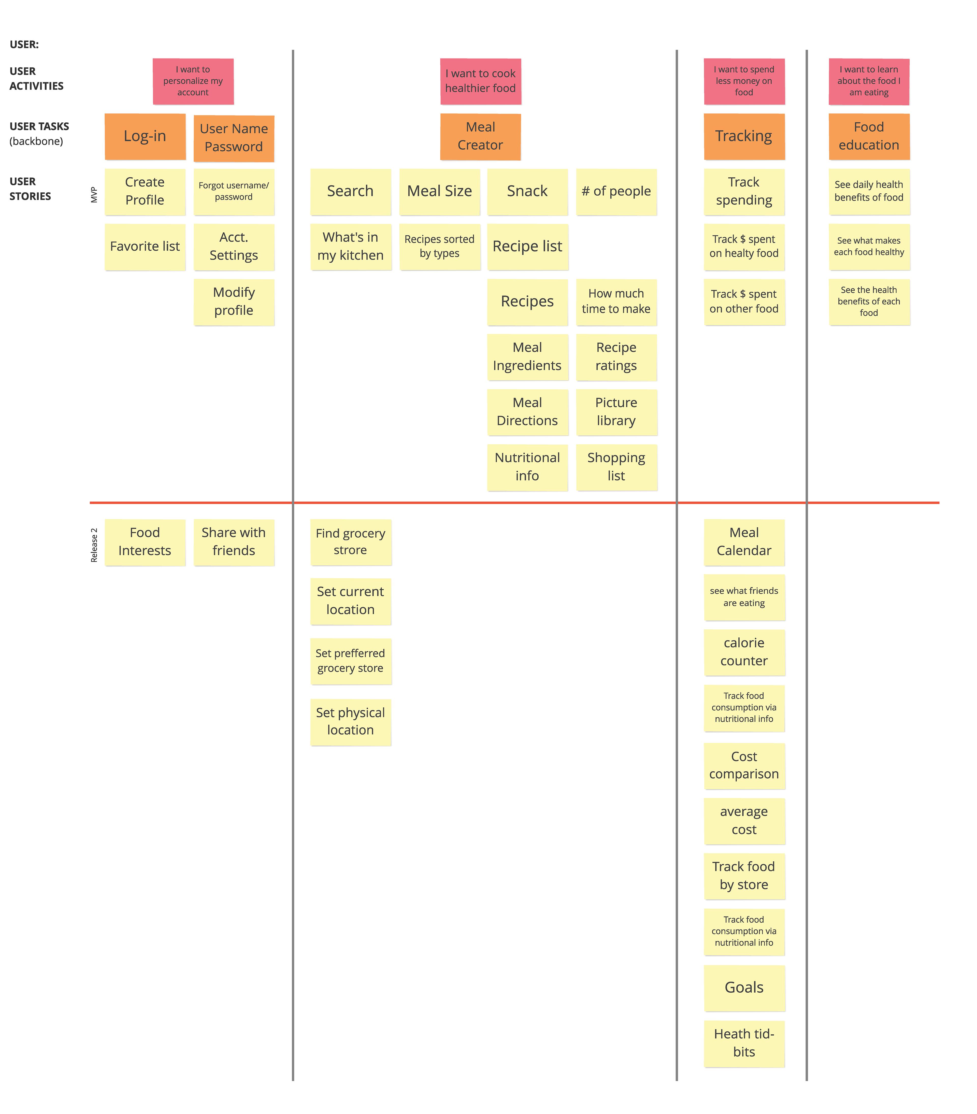
User Storyboard
For me, this was the hardest part of the whole challenge. Our first attempt was a failure but a good one to learn from. We didn't focus on our persona and what her goals were. After getting feedback and a little guidance we were able to correct it and came up with the following user storyboard and the MVP (Minimum Viable Product).
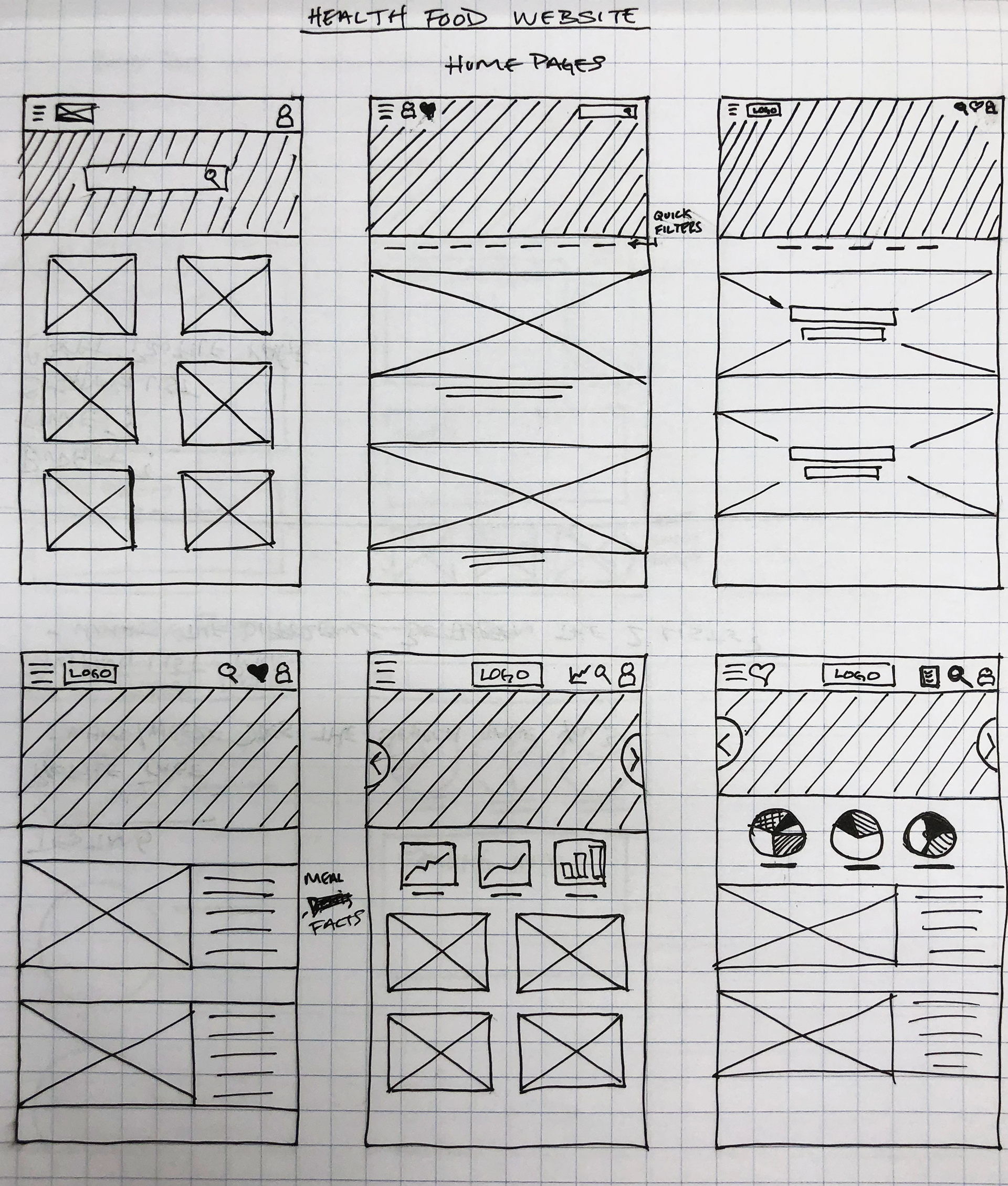
Sketching It Out
With the storyboard set, I started to formulate what this mobile first site was going to look like. I took on the home page, profile page, recipe page, learn about page and rankings page. Below are my sketches.

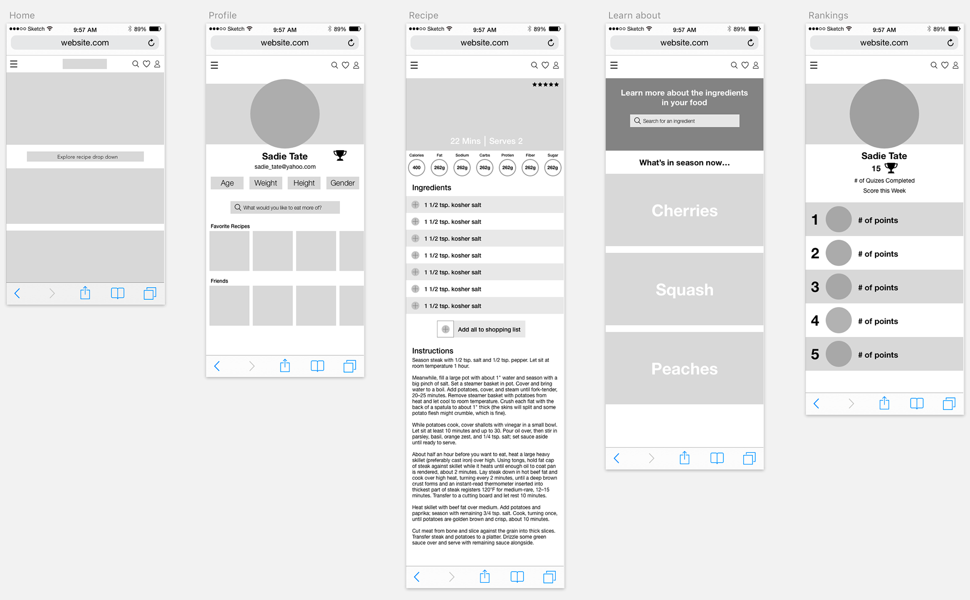
Lo-Fi Wireframes
The next step was putting the pen and paper sketches into low fidelity wireframes using the Sketch App. After testing the lo-fi pages with a few people we discovered a couple of usability issues:
•Users found it hard to find the "Meal-Creator" page and the "Learn About Ingredients" page.
•Adding ingredients to the shopping list was confusing.
•Adding ingredients to the shopping list was confusing.
We addressed these issues going into hi-fi.
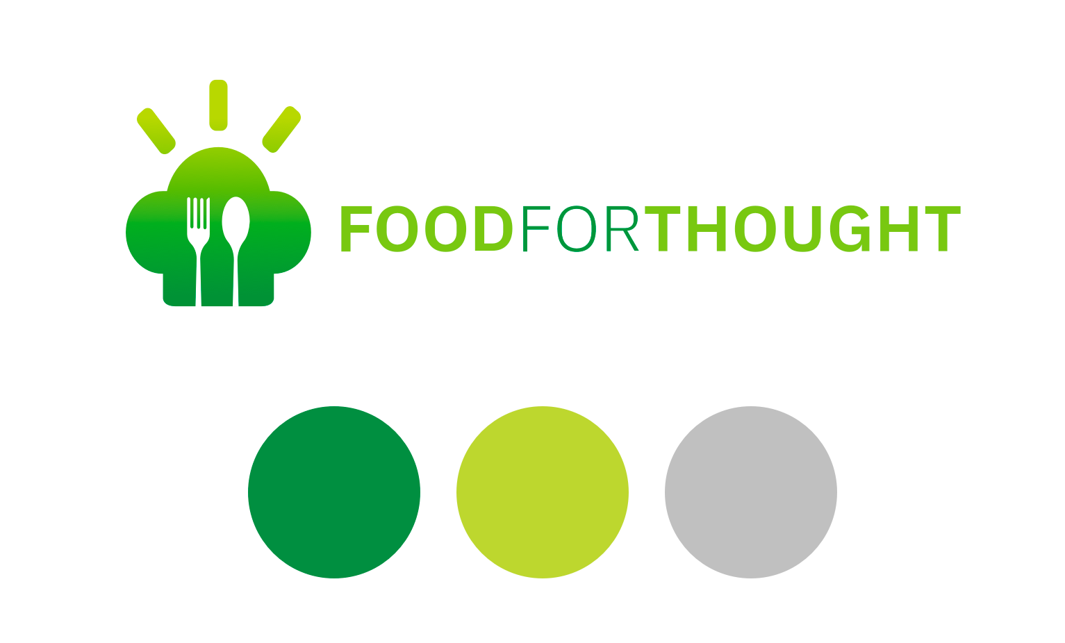
Logo
I came up with a quick logo to go with the website. I decided to use a green gradient that gives a fresh clean feel to go along with the eating healthy aspect.
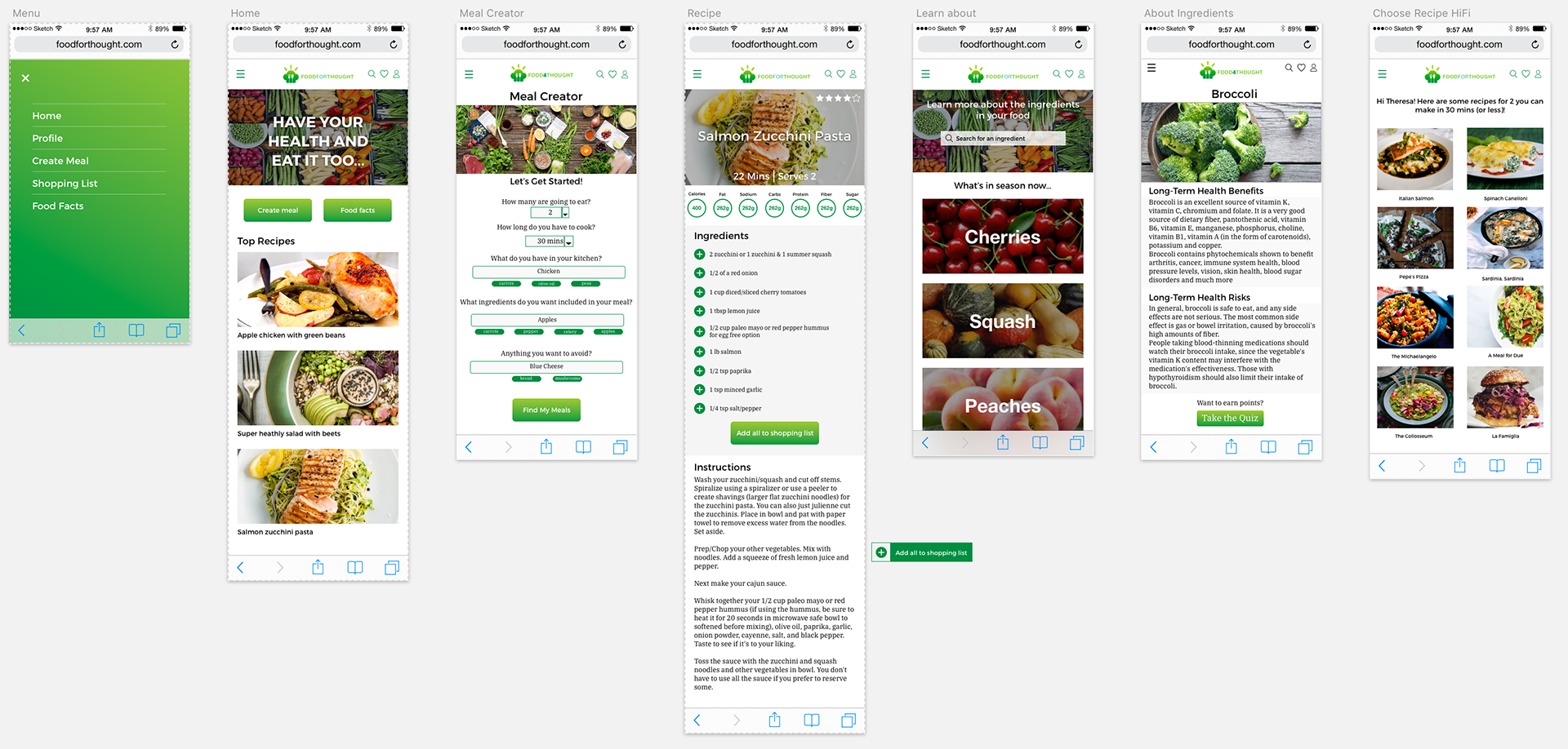
Hi-Fi Mockups
Now that we had user feedback it was time to create the hi-fidelity scenes. Having a graphic design background I was able to help the team with the design (colors, typography, images and layout).
Prototype
Once we had taken all of the screens to hi-fidelity we used Invision to prototype and conduct more testing.
Conclusion
Having been a graphic designer for 8 years, this was a great project to implement the new tools and steps that UX designers use. It was a big eye-opener to understand and see the thinking that goes behind more than "just pretty looking design". Boiling it down to the fundamentals of how people think and use websites was challenging and in the end, I believe that this project was very well put together and solved the problem that we set out to solve.
Tools Used
Adobe Illustrator, Adobe Photoshop, Sketch, Invision