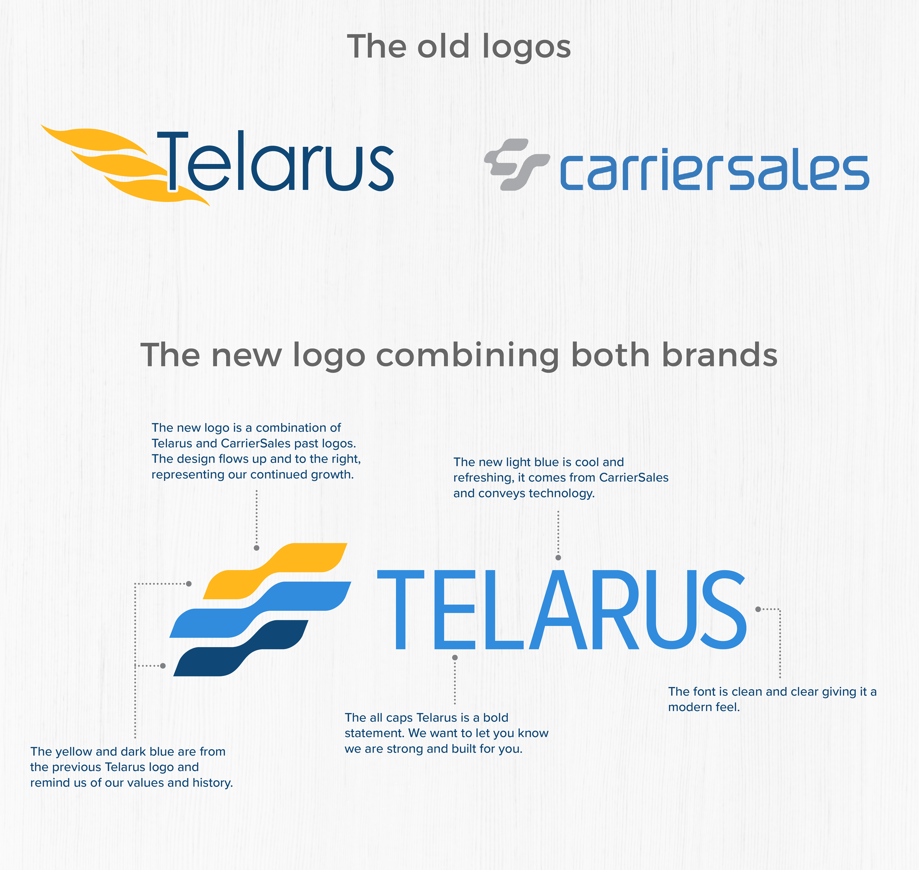
In January 2018 Telarus acquired CarrierSales. The decision was made to create a new logo that would incorporate both companies look and feel. I had been wanting to create a new Telarus logo for a long time. I never really like the old one. It was heavily weighted on the left side and limited in the uses because the icon and text flowed into each other and could never be separated and maintain the brand image.
I used elements of both the logos into the new one. The three waves of the old Telarus go back to where the company started in California and the owners loved to surf the waves. From the CarrieSales logo, I took the new blue which made the new logo pop. The curves on the "C" were incorporated into the new wave design.
Below is a graphic that talks about the new logo and the meanings behind some of the elements along with a video that was done to show the relaunch of the two companies coming together.